
A Note From Rebecca: On Seeing Color
May 8th, 2025
An assignment in art school asked us to paint an egg on a white piece of fabric. The purpose was to get us to really look, to see all the colors there. It reinforced something I’ve always loved about nature: The colors are so alive. Even ones that look solid contain so many others. The more closely you look, the more colors you see, and that inspires new ways to use them.
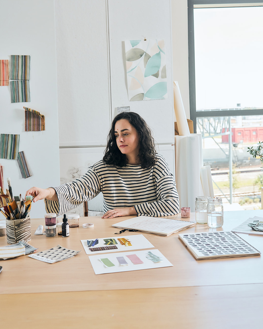
In the studio, I spend a lot of time honing colors. That means hand painting my color standards, examining them in different lights, and looking at how they connect with one another and build worlds. I like to sit with them and play with pairings to see what enhances or deepens or clarifies them. The slightest shift can completely change how a color looks and what it makes us feel. That’s something I learned in art theory class, looking at Vermeer’s blues, Caravaggio’s reds, and Josef Albers’s color studies, and I use it to guide my textile work. For example, our new Bramble woven fabric in Sunlit Ochre complements the goldenrods in our palette not because it matches them but because it’s a bit darker—it has a grounding effect. Similarly, I was inspired to create our new Red Echinacea color after seeing how a bunch of the flowers set off the blues and browns in my dining room. It instantly made them feel fresh. Other times, I like to pair colors that have a similar value, meaning they sit in about the same place on the scale between light and dark. The effect is rich but still calming because the contrast is lower. You can use saturated colors like yellow and pink or purple and orange together and it still feels harmonious and balanced and easy to live with. I want to write more about my approach to color; for now, you can also read about my color bins and why the colors we’re instinctively drawn to matter.

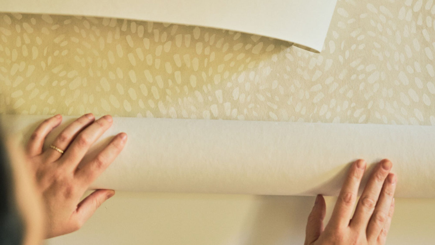
Our Color Collection, debuting our first-ever solids, is an ode of sorts to the art of looking. I wanted to make sure I had built bridges of value, saturation, and hue with our existing collections, so I can open more possibilities for the kinds of spaces you can use them to create. When the color blankets and strike-offs arrived, I cut them up and put them on the studio wall. While holding the swatches in my hand, pinning them up, and stepping back, I was evaluating the color. Seeing it from a distance is important because that’s how it will look in a home, but the up-close interaction is too. That’s how I know you’ll experience it when you pull the swatch from your color library and share it in a presentation. That’s how it will look and feel when you sit on a sofa cushion upholstered in it or draw curtains sewn from it. Each time is an opportunity to fine-tune the exact version of the color.

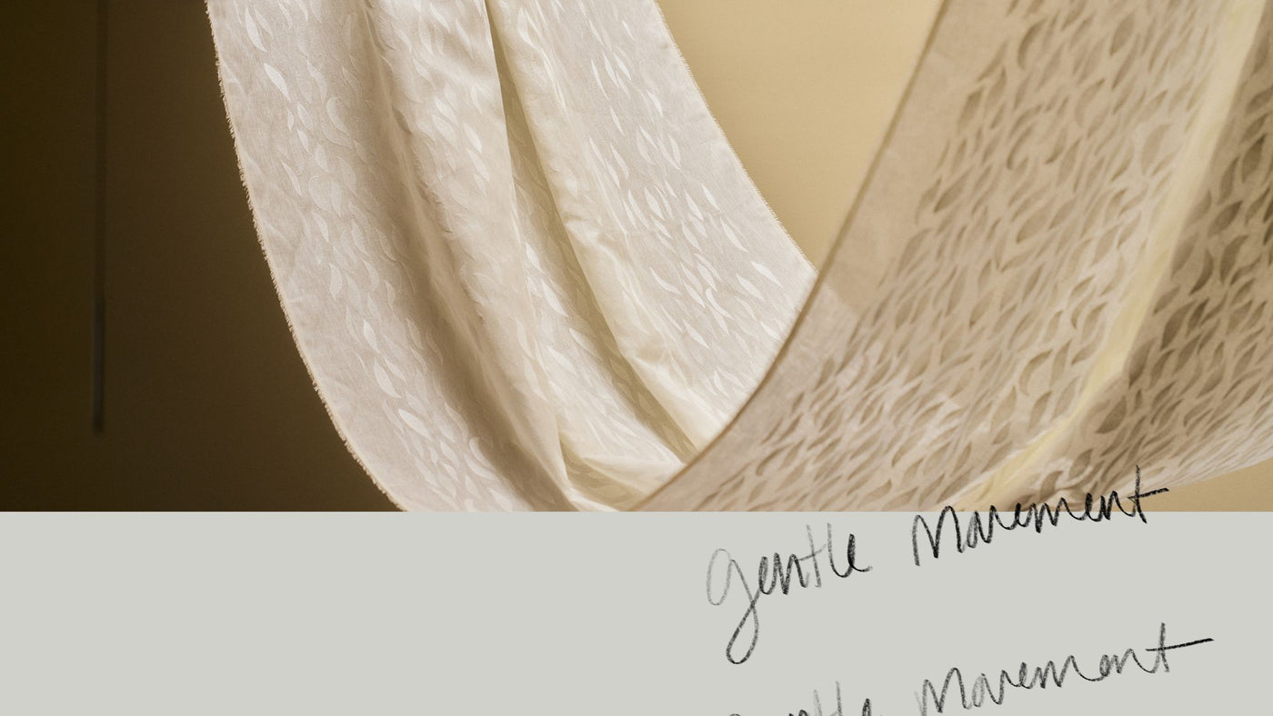
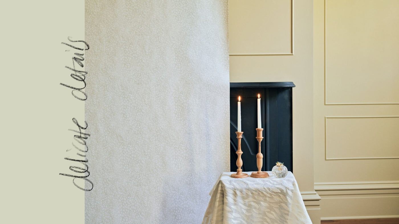
The new designs—three fabrics and two wallcoverings—are intended to be used like solids, though really they’re anything but: Bramble, an upholstery weight woven fabric that we’re also printing on grasscloth wallcovering at a slightly larger scale; Park, a midweight indoor-outdoor performance woven fabric; and Alder, a printed linen and wallpaper. Each comes in eight to 10 colors that I designed to be active and chameleon-like. Every time I look at them, I notice something new. It depends on the light, the time of day, where I am standing, and even my mood. Of course, this is true of any color, even if it’s a single pigment printed flatly on a sheet of paper, but it was my specific intention for this collection. For example, one of my favorite colorways of our Park woven fabric, Daybreak, can read green or even as a linen-like neutral from across a room. But when you look closely, you can see that it’s shot through with blush pink, golden yellow, and citrine. It can even appear blue. It reminds me of the early morning when the sky is brightening and areas feel green. It’s like a leaf bud. I wanted to make it easy to see the “connecting colors” you can use to build out a room. I can sense the potential, and I hope you can too.
Color is a daily pleasure we can tap into. It reminds us of beauty and joy. I want more of that for all of us. I hope this invites you to bring more color to your projects. I also hope it will help you convince others—whether a client or another family member—to use more color.
Thank you, Rebecca


