
A Note From Rebecca: On Studio Work
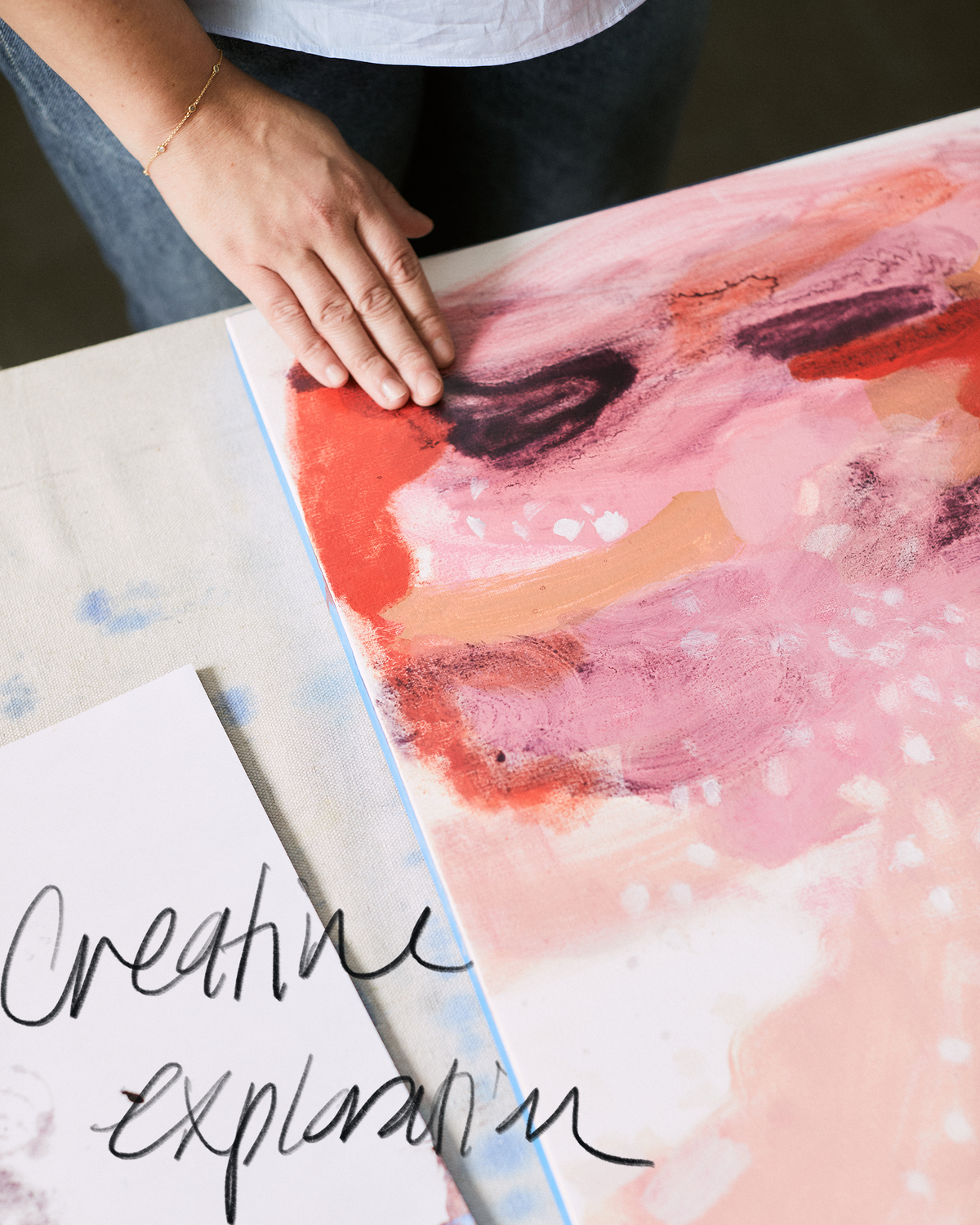
Last winter, I sat down to do small paintings to send out with thank you cards for our 10-year business anniversary. I pressed some flowers myself and bought more on Etsy. To make each painting, I glued the flowers down onto paper and painted stems and leaves to add a personal touch. Those dashed-off little paintings ended up looking really charming and actually evolved into a new wallpaper that’s included in this collection, Pressed Flowers. The thing that amazes me is how quickly and effortlessly it came to be. It’s one of those patterns you might see and think was complicated to make because it has so many different elements and colors. But I find that the opposite is often true: Things that look simple can take the most consideration to get just right.
The character of a line is often what makes me grab my sketchbook, take it to the scanner, and upload the page to my computer. I get this feeling that the sense of ease or energy in a line will make it a great wallpaper or textile. But sometimes after I’ve scanned it in and created the repeat, it doesn’t look quite right. I’ll try redrawing it and rescanning it until it looks exactly the way I want. Sometimes I never can re-create the thing I loved about the original. Other times, I need to paint the idea many times to bring an ease to the artwork.
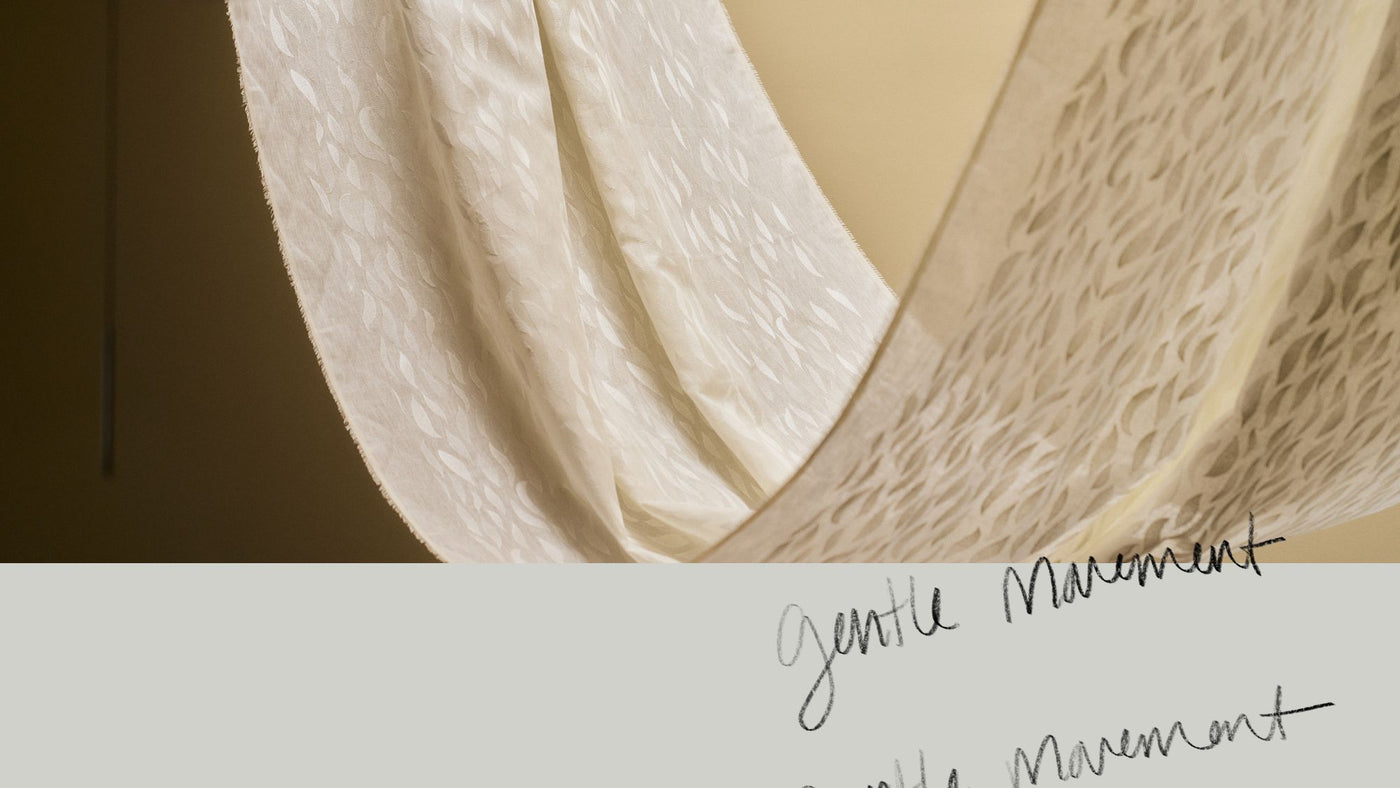
Ribbon Ogee, the other new wallpaper in this collection, is an example of a simple-looking pattern that took time to perfect. I did the repeat and even printed samples, but I wasn’t happy with it. So I went back and repainted it, rescanned it, and tried the repeat again. Then I tried printing it on a different ground. In the end, I got the ease I wanted—but it took some trial and error. The pattern is a bit traditional, but it has a soft, organic, almost ballet-like movement that makes it feel modern and painterly, which is exactly what I had in mind.

It can take a lot of exploration and several attempts to make a pattern look effortless, but it’s worth it to capture that feeling. Of course, I love the feeling of breathless patterns that just tumble out too.
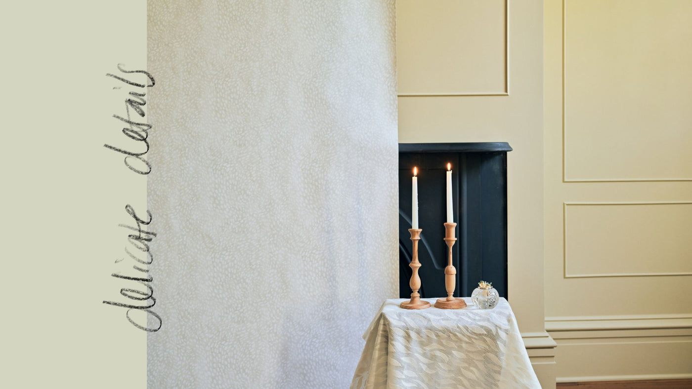
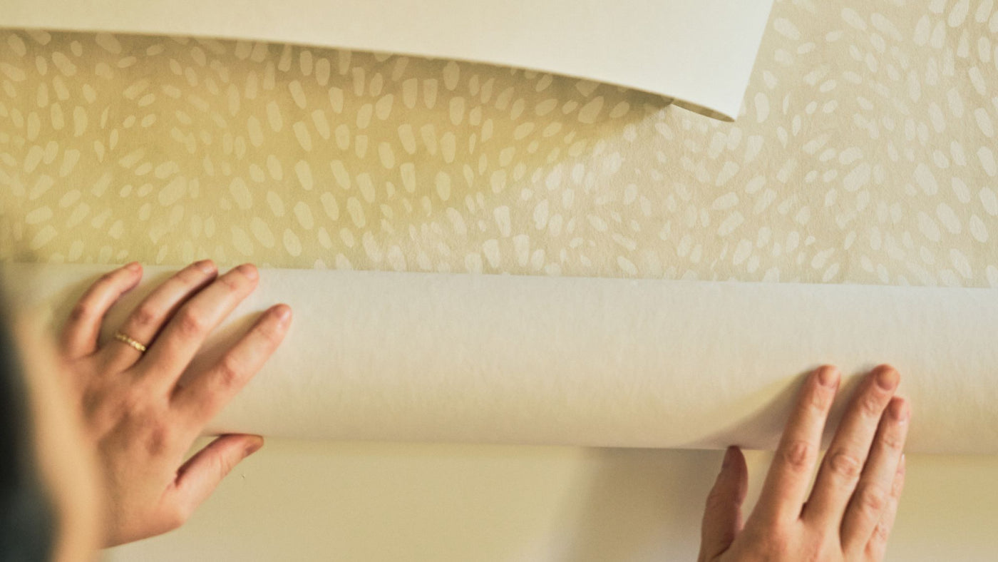
That exploration doesn’t end when we introduce a new pattern. I’ll look back at patterns and think, I can’t believe we don’t have that one on a gray ground! The conversation stems partly from the colors I’m feeling inspired by and partly from the colors we know you, our community, love and want more of. That’s why this season we’re introducing our Dotted Palm wallpaper in navy, pink, and a cool gray. We’re also expanding options for Marble Geode, a woven textile that uses our special artisan-dyed warp yarn, by adding a new blue and bringing back Blushing Taupe. As two of our most popular patterns, they may look simple, but I think that’s exactly what makes them so striking.
I can’t wait to hear what you think about our new prints and colors and see how you use them in your projects.
Thank you, Rebecca


