A Note From Rebecca: On Building A Color Story

August 13th, 2024
My daughter knew exactly what colors she wanted for her bedroom: orange, yellow, brown, and white—her favorites. So I pulled a bunch of fabrics in them for her bed canopy and curtains and let her choose. The canopy has Dashes in Tangerine on the outside and Sun and Moon in Blush/Gray on the inside, which feels really magical to me. She picked Petals for her curtains; it’s what we had used for our closet in Brooklyn, which I thought was really sweet and nostalgic.
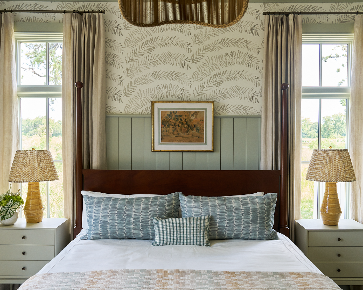
We introduced Sun and Moon in 2017 and Dashes and Petals in 2015. I love how the colors are good friends to each other but don’t exactly match. It makes the combination feel less constructed and more like what you’d see in nature. That’s how I want the colors I use in each new collection to be. When I’m building it, I consider the colors we have in our archive and imagine how I want to expand on them. It’s very much like adding layers of textiles and decor to a room in your home. I want to complement what’s there in a way that feels organic and authentic but also evolves the landscape in a fresh way.
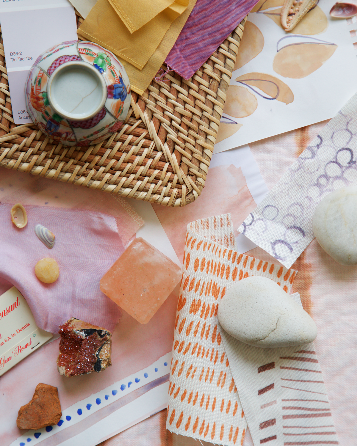
I start by going to my color bins. They’re in a cabinet in my studio, and the bins are filled mostly with hand-painted color standards I’ve made. I don’t use Pantones; I paint my own standards in gouache. It’s something I’ve done since college that helps me specify the precise colors I want, with exactly the right finish and variation and movement. When I’m making them, I play with different versions of the same ideas: lighter, darker, more green, more blue, more saturated, less saturated. I also use the bins to collect bits of inspiration: fabric cuttings, paint and tile and wood finish samples, yarn, paper, scraps of restaurant menus, random magazine tears, and pictures of landscapes and rooms I love.

When I’m pulling color inspiration, I try not to think. Instead, I try to let go and trust my hands and body and eyes—they’re telling me things I already “know.” I go through each color group including neutrals and pull out what speaks to me. There are colors I pull time and again. They tend to feel a bit core to me and what I like. Since I spend time reflecting on this sort of thing, I know that many come from the landscape of my childhood on Cape Cod. Sometimes the colors I pull evolve—maybe I’m feeling greens that are darker and more grounded versus light or maybe it’s that I’m just loving all the shades of green. Sometimes I get bored of certain colors and limit the palette to one or two shades or I decide I want to expand it and explore a new blue I haven’t tried before and see what works with it. And then there will be colors that tell me about things I’m craving. Maybe it’s a bright pink whereas before I loved a peachy hue. Layering them in changes the way the core colors I return to time and again feel.
What I do try to think about are the things that’ve caught my eye lately. Maybe I pulled out my phone and took a photo or a note when I saw it…
The electric yellow-green seaweed against the gray-blue wet sand at the beach.
The beautiful purple of the eggplant in the green fish curry from XBB.
The bold contrasting stripes on the caterpillar munching on the milkweed in my front yard.

Having these images in mind might make me pull something I hadn’t thought about. It might not—or it might not become part of what I’m working on now and need to wait for another time. Visualizing these moments and making them physical is an important part of my practice.
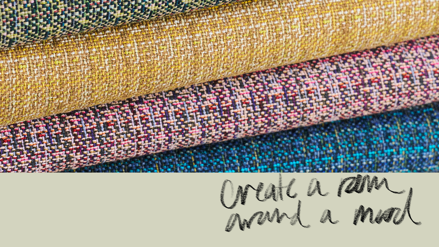
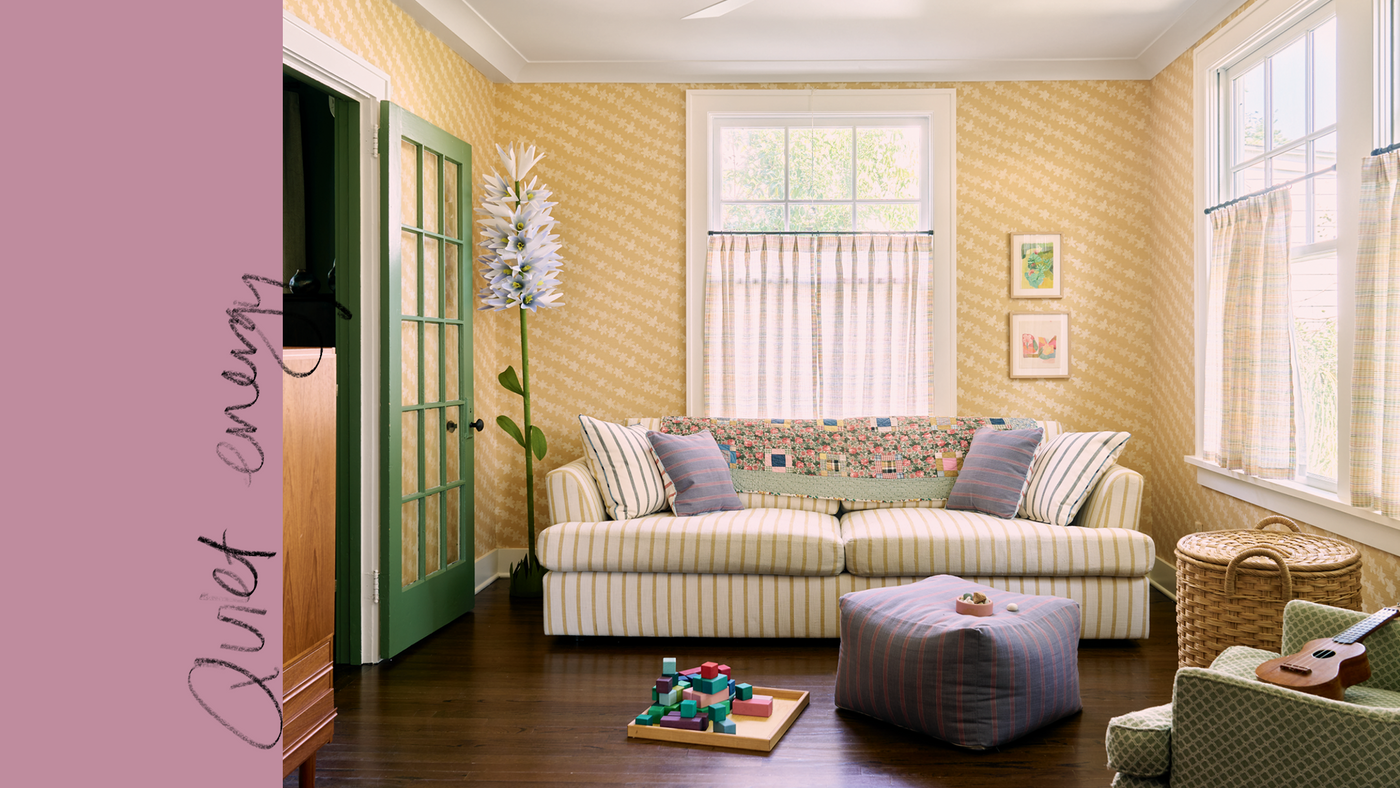
The colors I end up with always surprise me and teach me something, and bring fresh energy to my work. Color has that power—it changes our mindset, it sets a new mood. When I look at my swatches all together, spread out on a table or pinned up on the studio wall, I feel excited about all the possibilities. It’s my hope that the color stories in each collection do the same for you.
Thank you, Rebecca


