Southern Living Idea House
I’m thrilled to be a part of the Southern Living Idea House. When Allison Elebash asked me to contribute, I felt so honored. I love her work and think she truly epitomizes lowcountry living—a newer concept for me, having lived in the Northeast for most of my life. Allison is not only a talented designer but a friend.

To choose designs for the house, we began by looking at the paint palette Allison had picked out. This is a project that moved quickly, but she intuitively pulled paint colors that brought warmth to a new build.
The earthy, comforting palette—composed of Sherwin-Williams Mushroom, Breakwater, Soft Sage, Bateau Brown, and Carnelian—balances darker hues with lighter, airier ones. The combination feels in line with the landscape. The Kiawah River, with its old oak trees, marshland, ferns, and swaying grasses, provides such a beautiful setting.
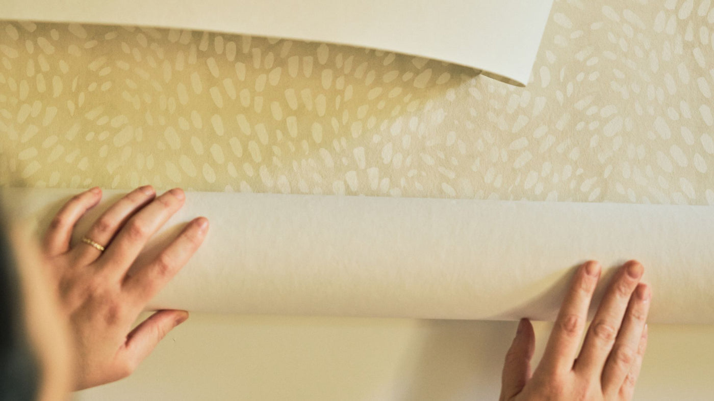
After we reviewed the colors, we began pulling wallpapers and fabrics that fit with them, her design concepts, and the overall mood she wanted for the home. While some colors sat perfectly with the palette, we also decided to translate some of my designs into custom colors tying back to the chosen paint palette.

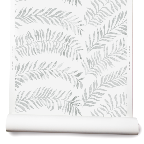
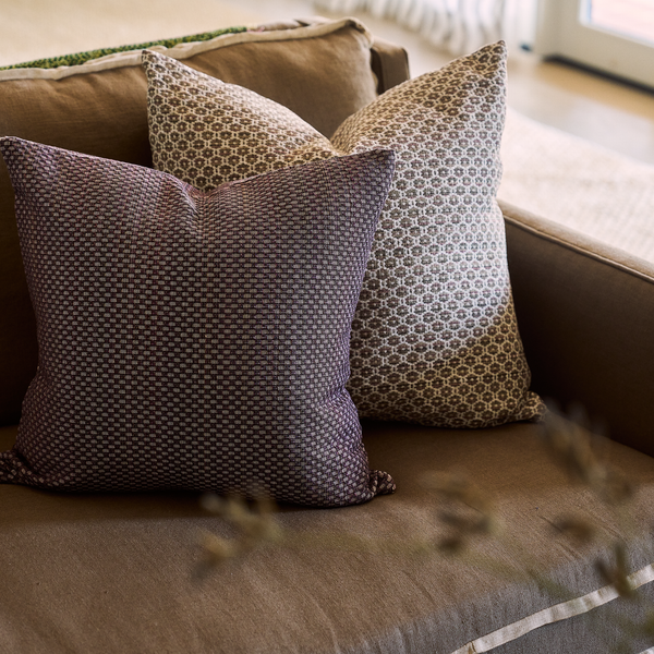
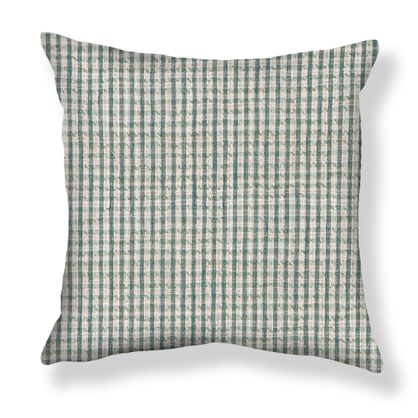
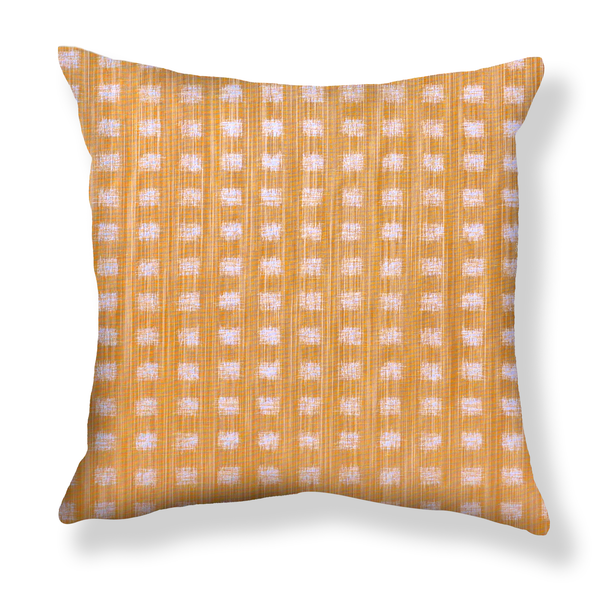
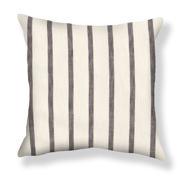
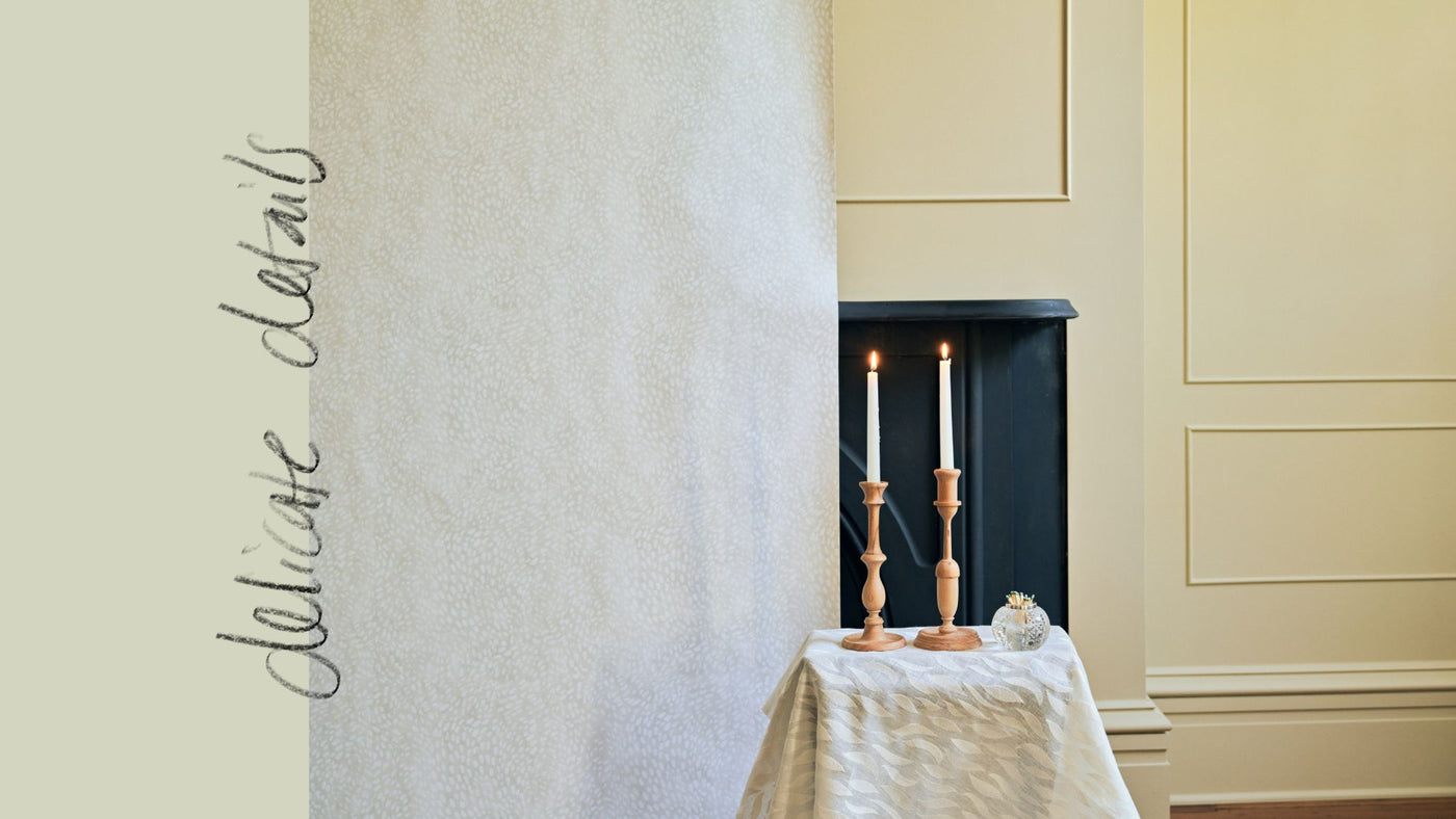
Color matching different materials is a tricky process. I don’t think you can ever get a perfect match—but that may be because I am always looking at color so closely. Different substrates give the “same” color a different character. They reflect light differently, even if they have the same white point. Fabric absorbs and reflects light differently than paper or paint. You can print or tint the ground to make it warmer to try to match, but it's always going to be just a little different. That’s one reason why I always aim for colors that feel like they are very close friends rather than a perfect match. Friendly colors have the same undertones, they connect, they relate. One might be slightly lighter or darker. This is more natural, like the landscape outside. Sometimes it makes sense to tweak one color more than would be a closer match —for example, you might want the wall to be slightly lighter or darker to recede more. We did this with our Little Palm wallpaper in Taupe. It’s just a bit lighter than the fabric, and it looks great that way.
We also needed to pick wallpaper patterns that would sit with the paint colors. Sometimes you want a match, and sometimes you want contrast, but ultimately the colors in the paint and wallpaper need to have something that connects them.

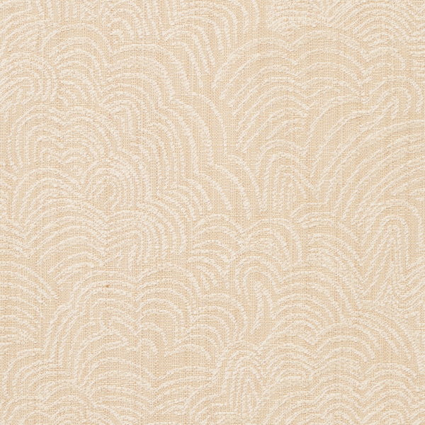
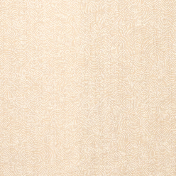
Entryway: Hampton Park Mural + Mushroom
For the entryway, we chose a mural I had been working on called Hampton Park, which I painted outside at Hampton Park in downtown Charleston. It felt like a natural choice given the large oak trees outside of the home. We decided to tweak the color of this design to sit with Sherwin-Williams Mushroom. I originally sampled a colorway that I called wheat, a lighter neutral but with more yellow in it. We wanted something that worked the warmth of Mushroom but didn’t go too yellow. Depending on the light, the resulting color of the mural can read quite differently. Neutrals can be quite tricky—they play off of one another when the palette is limited—so a color might read pink, yellow, or green instead of taupe, for example. For the second round of samples, I brought more options, and we agreed on the sand colorway you’ll see in the home. I ended up liking it so much that I made it an option for the mural when we launched it as part of our early fall collection.


Primary Bedroom: Marble Fern + Soft Sage
For the primary bedroom, Allison chose Soft Sage and used it to paint the wainscoting that runs three-quarters of the way up the wall. The way it looks reminds me of the idea of a field, where the horizon stretches out ahead of you, higher than your head. Given that, it felt natural and tied to the landscape to use an airy but leafy pattern on the ceiling and top portion of the walls. Allison chose our Marble Fern wallpaper, which we had made in a custom green-gray colorway (a slight tweak to our existing gray offering).


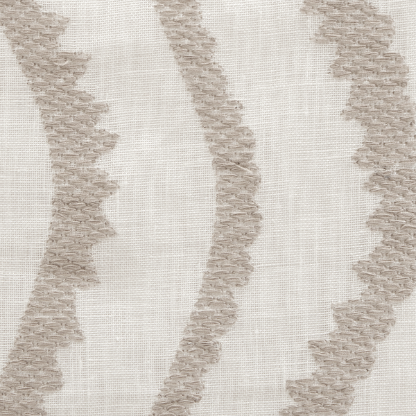
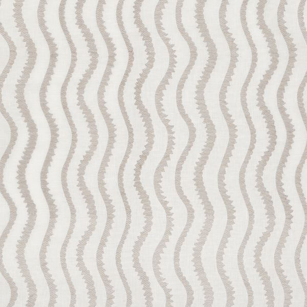
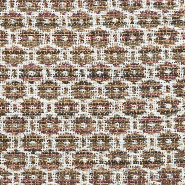
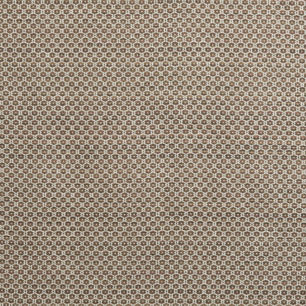
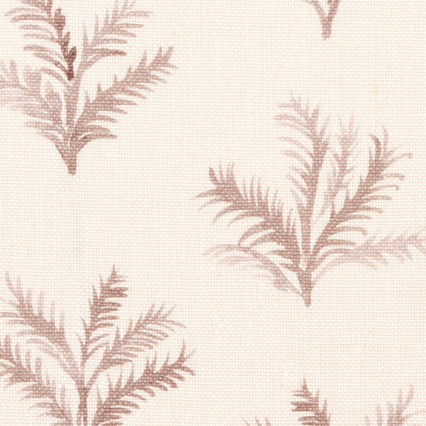
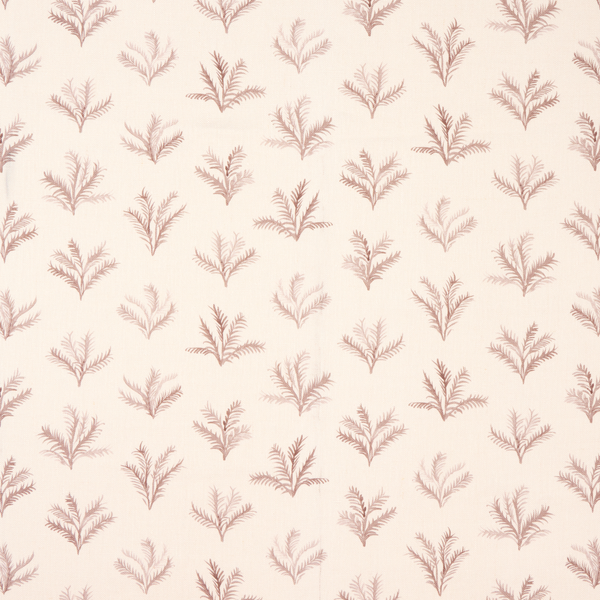
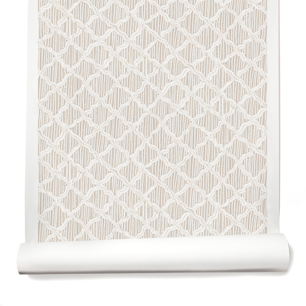
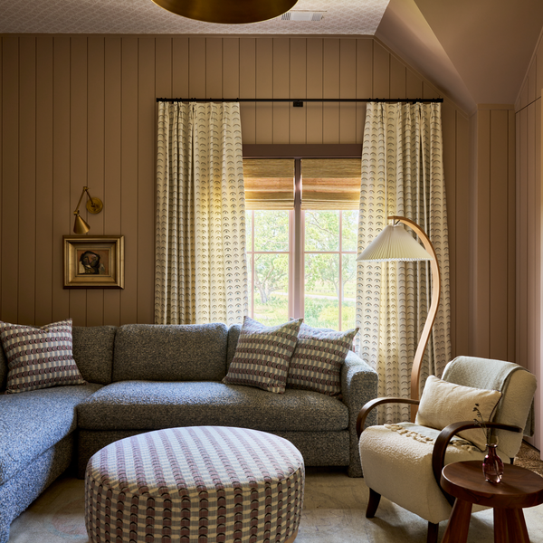
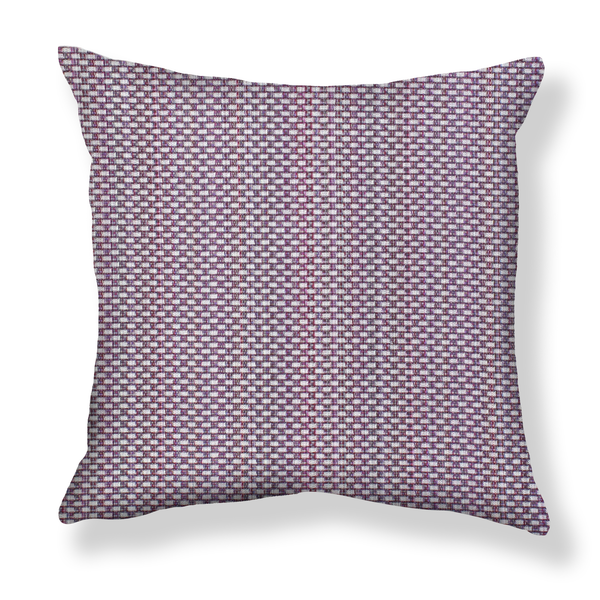
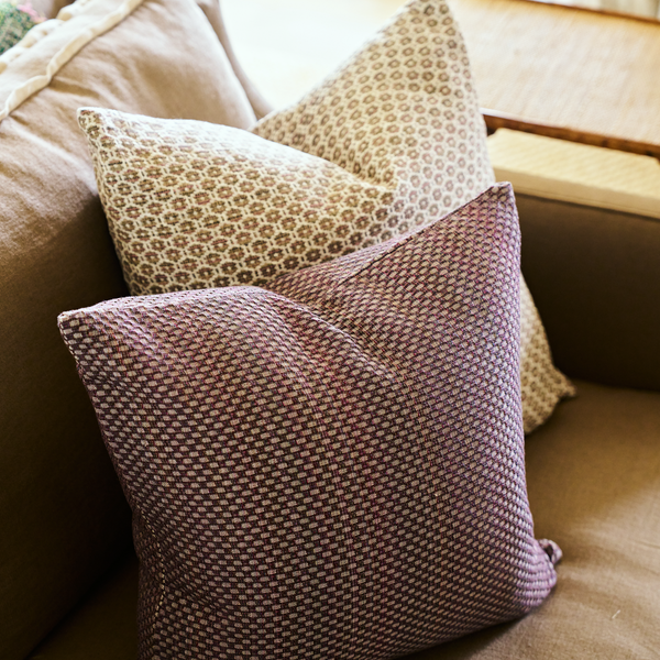
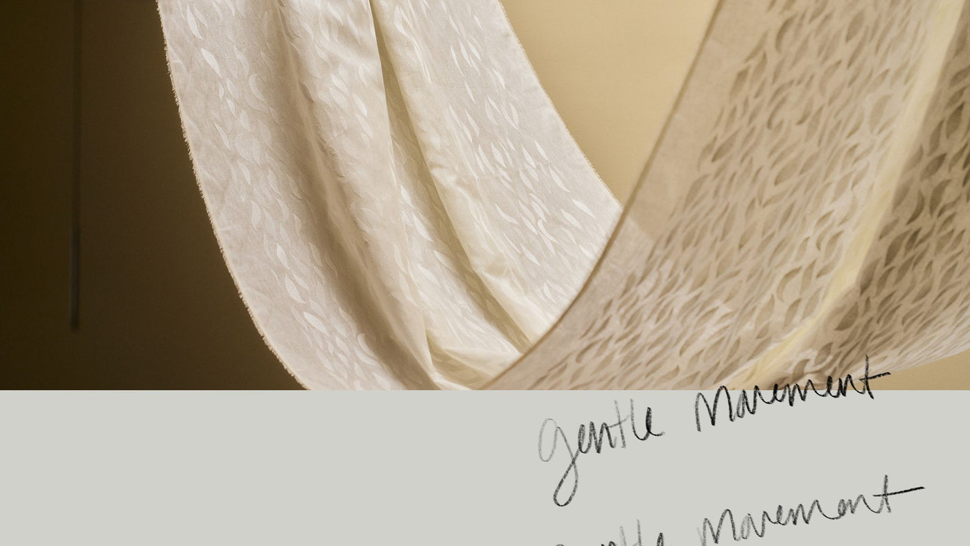
Second Primary Bedroom: Little Palm in Taupe Wallpaper + Fabric + Bateau Brown
For the second primary bedroom, Allison wanted to use our Little Palm fabric in Taupe on the curtains and asked if we could create a wallpaper to match. While we did offer Little Palm as a wallpaper, we didn’t have it in this colorway—and I could immediately see that we should. The fabric is printed on a beautiful creamy linen, so I created a soft, textural ground color for the wallpaper.
Although it can be fun to have wallpaper and fabric designs that match, it can be tricky as I mentioned. I often feel that the two materials have very different purposes and see that different things work better for one application versus the other. So, in this case, we intentionally made the wallpaper slightly lighter than the fabric. It just needed to sit back a little more. They don’t match perfectly, but I think they look perfect together.
The trim color is Bateau Brown, a deeper brown that brings contrast to the taupe in Little Palm. It brings the feeling dark stained wood trim would have, but in paint form. It gives character to a new home.


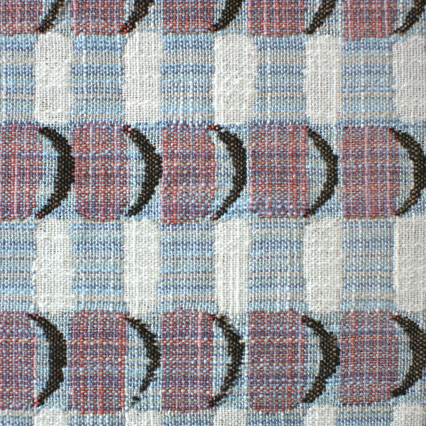
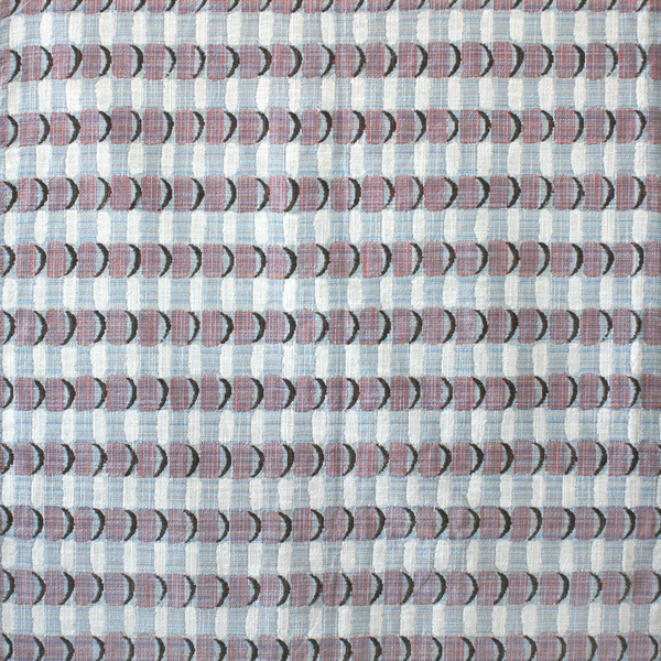
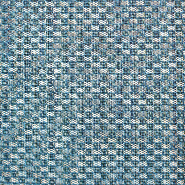
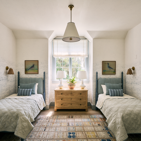
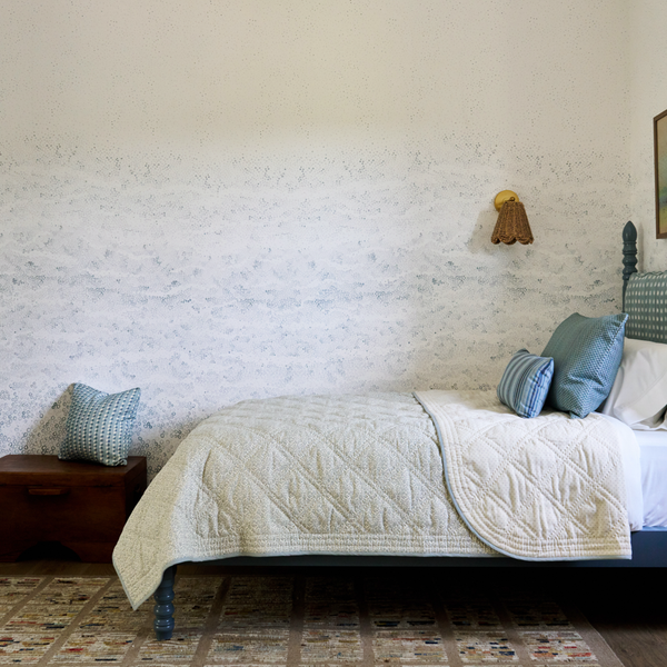
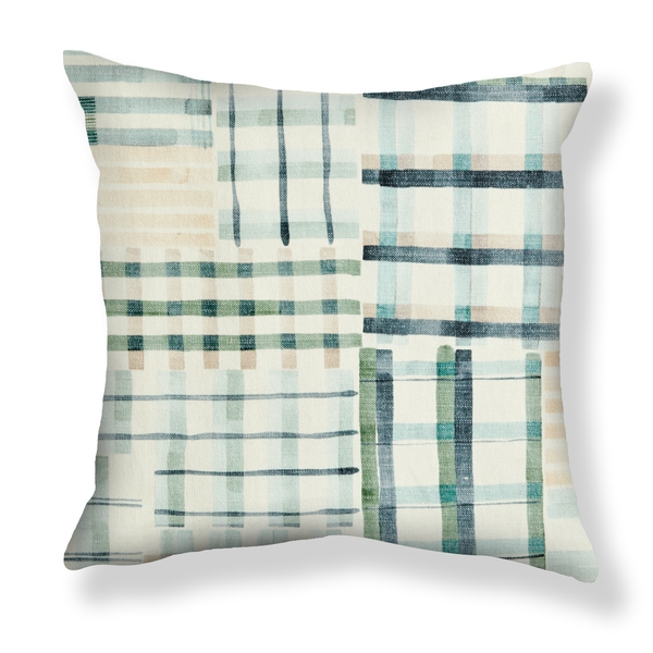
Twin Bedroom: Bubbles Mural + Breakwater
This is another example of a wallpaper that we didn’t tweak to match. The ocean-inspired Breakwater color complemented the Bubbles mural so nicely. The slight difference between the colors gives more depth to the room. I always think about tonal variation with color palettes because it makes them feel more natural. I love how this came together.


Powder Room: Hand Stenciled in Carnelian
For the powder room, Allison suggested hand-stenciling a design on grasscloth. I loved this idea for the dimension it would bring. Interior house paint is a perfect consistency for stenciling. The beadboard in the bathroom was painted Bateau Brown, and we used a slightly darker color, Carnelian, for the stencil.

I hope you enjoyed hearing a bit more about our color process. As always, we welcome your feedback. I am always thinking about color and how we can expand our collection in a way that opens up new possibilities.
—Rebecca