
A Note From Rebecca: On Black Ink
October 20th, 2025
One of the mediums I return to time and again is india ink. I fell in love with it in my freshman year college drawing class. We mixed three containers of water and the deep black liquid: light, medium, and dark. Inevitably, the water cup became the fourth, lightest option, and I could dip into the pure ink for the darkest shade. We used these sumi ink brushes that often splay out but can become a delicate point too. They’re very expressive, less buttoned-up than many watercolor brushes. It was a lesson on value and building up depth, but also about experimenting and loosening up.
An old friend gave me a bottle of india ink he still had from RISD when he was clearing out supplies in Brooklyn. It’s black with a green top, and it reminds me of those days when my fingers were stained black along the cuticles even after I washed them.
Now, black ink is an important part of my practice in more of a drawing way. Sometimes I get so tight when I use a pencil or pen, something that makes a sharp, thin, clean line. I find myself holding the pencil close and gripping, leaning over the paper. I don’t know that there’s anything wrong with that, although that’s the impression I got in art school, but it doesn’t really carry the feeling of the whole body and the movement. Working with ink I can feel that. I pick up my brushes, some of which have gotten more splayed over the years, purposefully to find that looseness. I also reach for them when I’m working on perfecting a shape. Drawing it over and over again helps me get to know it. I’ll try different brushes to see which one gives me the effect, the ease I’m looking for.

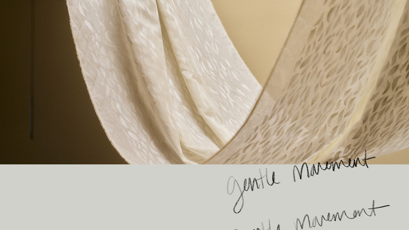
I don’t tend toward black as a color for design or clothing as much. I like something softer or more nuanced—a blue-black, a brown-black, a green-black if I’m going dark. Or a purple-black. But if I like something in black and white, I have a good idea that the shape is right, and then color can really make it sing.
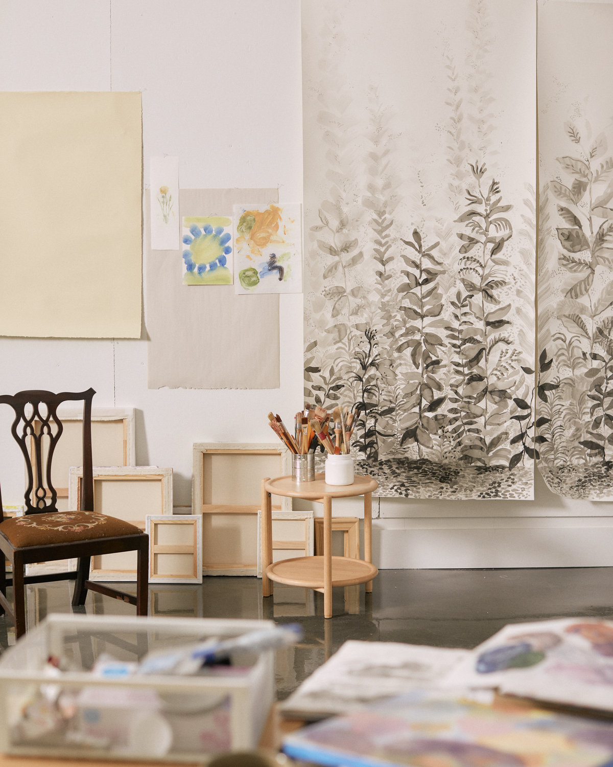
I returned to ink when I first started experimenting with ideas for murals. I was thinking a lot about scale and how to build depth, so it felt natural to pull back on color. I do that sometimes when I want to focus. I actually developed the mural we’re launching this season, Misty Morning, before and then alongside our Hampton Park mural. I painted it at scale on the floor and really leaned into the gestural movements my arms could make leaning over. I liked how the ink pooled in areas as the paper warped slightly despite being taped down.
There’s something great about working like this, in ink, on the floor, at a large scale, as opposed to sitting at a table and working in a sketchbook or standing up and painting a canvas hanging on the wall. You’re orienting yourself differently, and it’s physical in a new way. There’s something about looking down that pulls you in. It’s almost like working in the garden. I only noticed the similarities recently, because I’ve been working in my own garden more. Painting and gardening feel like connected practices to me—creating, growing, and trying to make the world more beautiful.


