A Note From Rebecca: On Color

May 9th, 2024
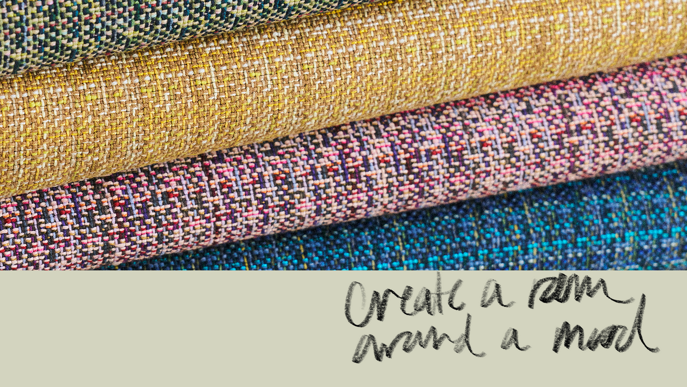
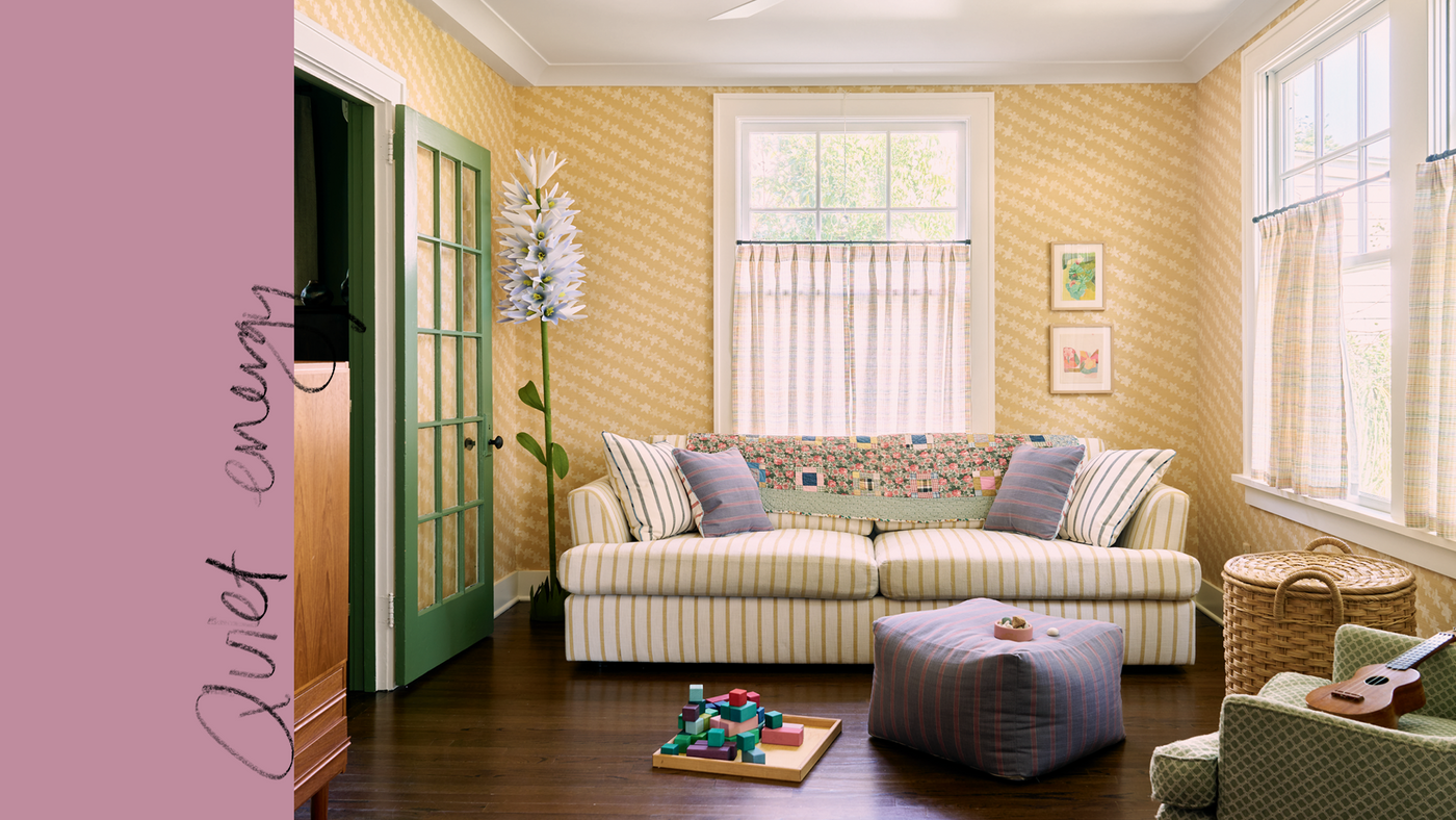
I recently brought home a pair of yellow velvet chairs. At first I thought what I liked about them was their shape—and I do like it—but I realize now that I was primarily reacting to their color. They’re a beautiful golden yellow, not goldenrod but deeper and maybe even a little tangy. Compared with my swatches of other yellows, this one is so rich. It reminds me again about the importance of pairing color and material. The velvet absorbs light differently and has this special, luminous quality to it. I was planning to reupholster them, but now that I’ve lived with them for awhile, they feel like they belong in my living room. Even if I don’t keep this exact yellow velvet, I know there’s something I like about it. It’s part of my living landscape.
I love how emotional—sensational, powerful, dare I say even biological—color can be. When we see something in a color that speaks to us, we can like it immediately. It doesn’t even have to be well-made or the right pattern or, as in the case of my chairs, even the thing we were looking for. We might not even realize at first what we like about it. We just feel drawn to it. If you don’t immediately see this around you in your home, you might see it in your closet—an ochre or a soft green or a tomato red you reach for over and over and that just makes you feel good. You might see it in the artwork that sticks in your memory from a trip to the museum or the colors of the landscape in your favorite place.


That pull is what makes color the most important element of design in the work that I do. There are a ton of other considerations, of course—hand feel, texture, pattern, motif—but all of those details are elevating. Color is essential. It’s atmosphere. It’s mood. It’s our landscape.
A few years ago, after her book Joyful came out, I had a chance to speak with the designer and author Ingrid Fetell Lee. Ingrid studies the emotion joy and how our physical surroundings influence the joy we feel. “The sensory qualities of our spaces can influence our emotions without us even realizing it,” she told me. “And the more we know about how to create spaces that support our well-being, the easier it will be for us to thrive.” Color is such an important sensory detail, and we get to choose the ones we surround ourselves with.
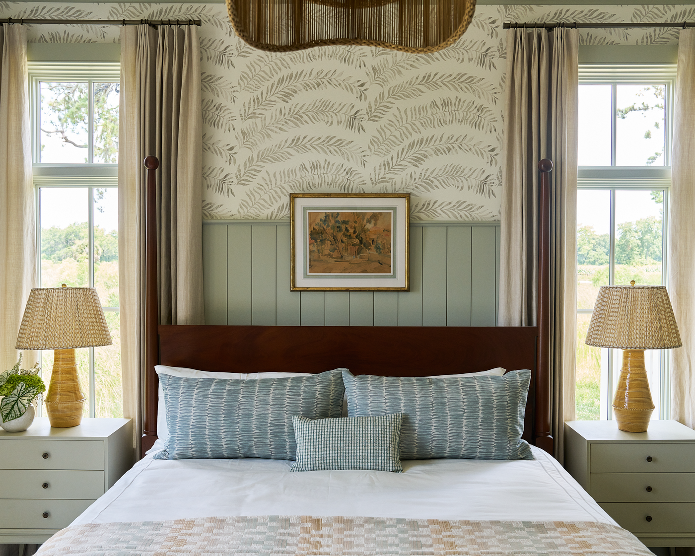
The colors we feel drawn to can help us feel supported, safe, and happy. My aim through my design work is to help you expand your horizons and show you how to use colors that resonate in creative ways, to inspire you to invite more color into your projects or even your own home. Every multicolor design I create is intended to serve as a springboard, a guide to help you build a landscape in colors you love. This might sound dramatic, but you should have color in your home even if you’re a minimalist.
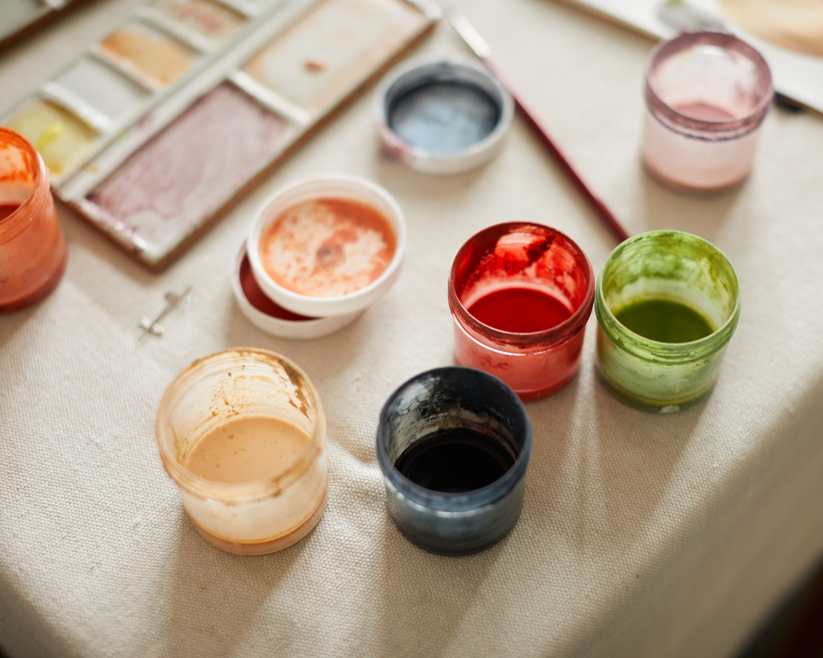
So if we agree on that, where do we get started? My ideas start in nature. Take a walk and look around, think back to landscapes you love—you’ll find what you need. Nature is the ultimate inspiration. It always has the answers. I’ll be writing more on color, and I’d love to hear from you. What are your favorite color combinations? What challenges do you face when using color? What do you want to know?
Thank you, Rebecca
Read my book, Living with Color to learn more about how color in the home deeply impacts us.


