
A Note From Rebecca: On In-Between Colors

Thursday, January 8th
You know the way the wet ground looks after it rains, when the sun comes out and the sky turns blue? That’s the color palette I’m drawn to right now. Rich and earthy, with something sharp and strong to set it off. It started when I was getting my dining room ready to photograph for my book and realized it was too blue. Sara York Grimshaw, an incredible floral designer here in Charleston, brought in deep red-purple echinacea flowers for the shoot, and I realized they were the clarifying color it was missing. Those flowers inspired me to change the window shades from bamboo to a woodsy eggplant fabric.
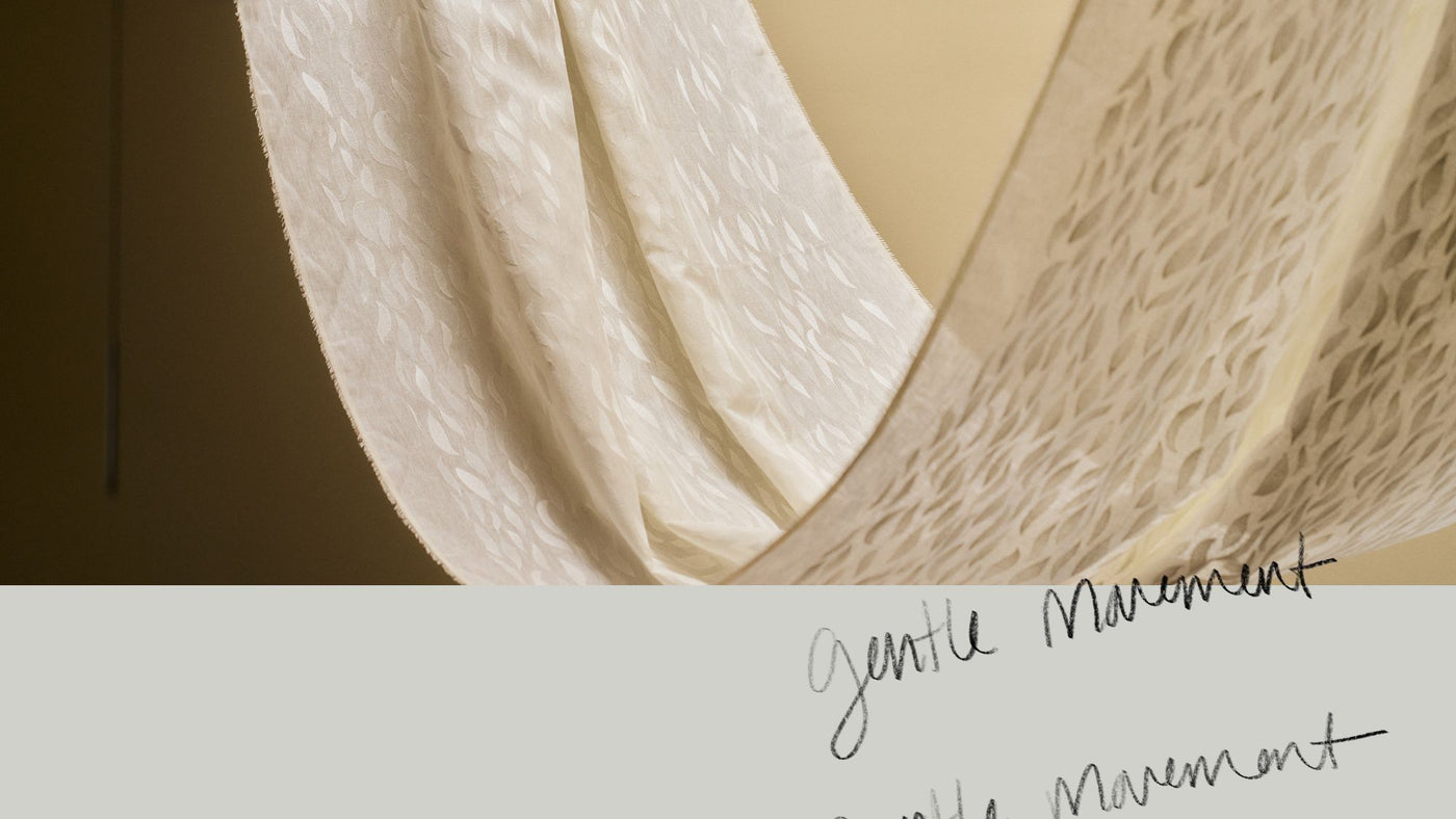
I’ve been experimenting with the blue-blacks, clay browns, and smoky greens in our growing collection in a similar way, pairing them with old favorites and discovering new combinations, as I think about how to share them with you. The process has me thinking about the colors that feel like a breath of fresh air, that can transform a palette. It’s my version of the “unexpected red” theory, in subtle, painterly colors like that deep purple red or even a crisp pale blue. Often we think of a paler blue as soft and dreamy, but it can be clarifying, even cutting, when paired with darker, earthier colors.
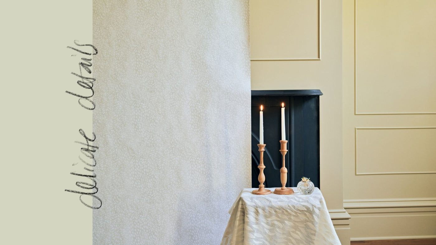
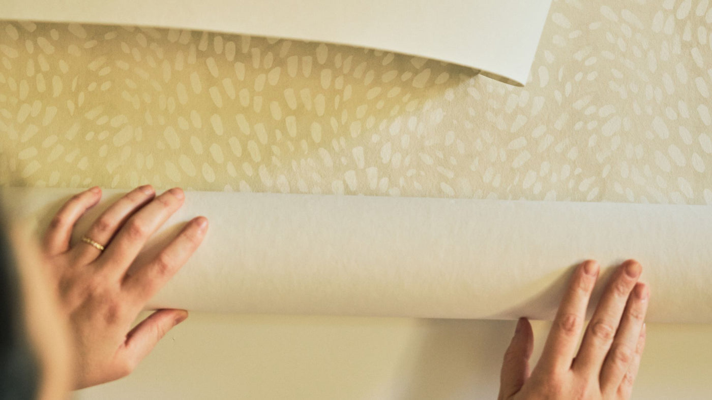
To create a world with these contrasting colors—whether it’s a set for a photo shoot or a room in a home—you also need to explore the shades in between. I often talk about color friends, bridge colors, or connecting colors, those that play nicely in a palette and build off other colors. They’re the key to depth and atmosphere in a home, just like in nature. When you use colors all in one value range, the results can feel flat. Choose colors in the same dark value range, and the effect isn’t moody—it’s just dark. There isn’t any contrast to ground it. Introduce white, and the contrast is too sharp. White is wonderful for a crisp effect (and it can be a powerful clarifying color), but if you want that hazy, cocooning feeling, you need to fine-tune it. Layer dark shades with atmospheric, in-between ones like sand or peach, and the effect is more nuanced. You transform the overall value range of the palette. It becomes softer, moodier, cozier.
These connecting colors are so important. I see them as foundational colors in our palette. Our line has been described as pastel, and many of these colors can be categorized that way, but that belies their versatility. They’re the essential layers every color palette, including earthy, moody ones, need to look and feel authentic.
I’m excited about the color explorations we have to share with you this year, starting with some moodier colors in this latest collection as well as our March collection. May will be all about white, and then fall will be a wider mix. In the meantime, I’m excited about the two new patterns we’re introducing now because they’re so helpful for telling a color story. Both are multicolor stripes—one airy, one dense—and although they contain only bands of each of the colors in them, they can inspire the palette for an entire room. Rather than looking graphic, the stripes are prismatic and atmospheric. They make me think of walking quickly through the park so that all the colors blur, or the drips that happen when a painting is drying and the colors blend together. You can pull out your favorite colors and build a space from them. In my own sunroom, I used PicnicOpen in new window fabric in the rainbow colorway for cafe curtains and, to highlight the yellow in it, Stamped GarlandOpen in new window wallpaper in Goldenrod. The combination is like sunshine in winter; it looks so happy with the sun filtering in. I can’t wait to hear what you think of them and see how you use them.
Thank you, Rebecca


