Behind the Pattern: Speckled
Like many of my designs, this pattern began in my sketchbook during the early days of starting my line. After years of working in the design industry, I felt a pull to return to my own art practice. A sketchbook felt like the easiest way to do that—intimate and low-pressure. It didn’t need to be perfect or even something I liked. I could turn the page and move on. But I loved that it held everything together, a place I could return to and see what I was thinking during that time.
In those early days of starting my line, I focused on mark-making without a specific direction in mind. I wanted to see what came onto the page that interested me, versus creating a pattern for a specific design brief, trend, or direction that fit with what a retailer needed. At the time, I was living in Brooklyn, and I found myself craving the textures and pared-back palette of Cape Cod’s dunes — the landscape of my childhood. Sketching became a way to reconnect with those organic textures and rhythms I missed so much. It was also a way to quiet my mind, much like journaling.

I often would work just with India Ink, a medium I’ve returned to time and again after experimenting with it as a freshman at RISD. I was struggling with a desire for perfection which left my linework tight, controlled, and probably a bit flat. I remember being so frustrated. One project helped: We mixed three versions of ink and water to build up light and dark areas in our drawings. It was messy and fluid, and it gently let me loosen up and see differently. I also realized I was more comfortable with a brush than a pen. Later, that medium carried through to my design work—black ink’s high contrast makes it easy to scan into the computer, clean up, and recolor.

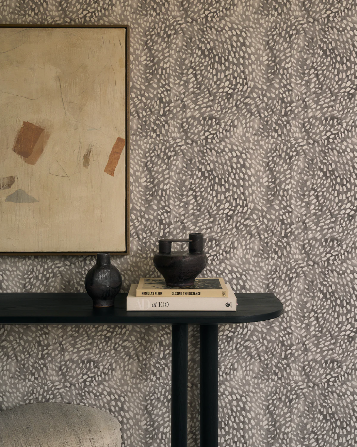
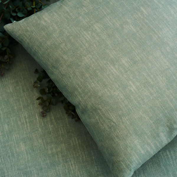
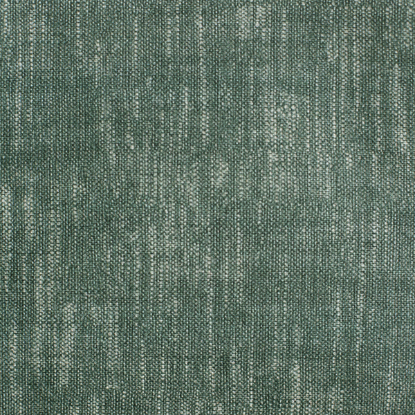
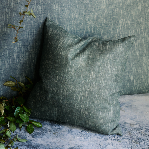
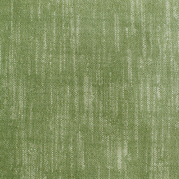
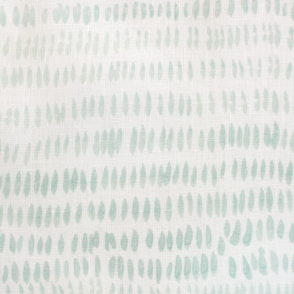
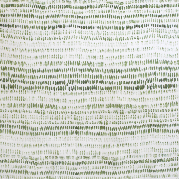
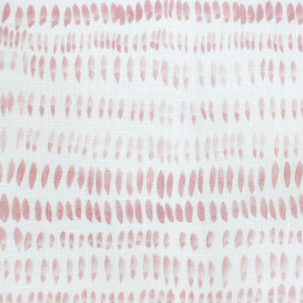
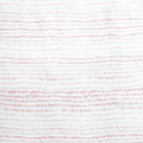
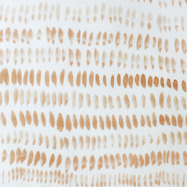
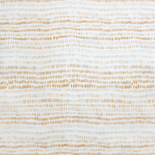
Years later, Speckled emerged from this love of ink. I painted a wash of ink across a spread of sketchbook pages, creating a darker ground to work from. I wanted something to add white marks on top of. The wash added subtle movement, a natural effect of the medium. All of this I can say looking back, but the decisions made in my sketchbook are often intuitive and fleeting. Editing comes later.
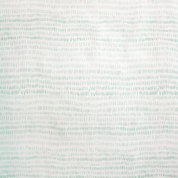
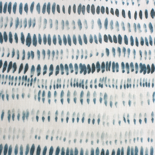
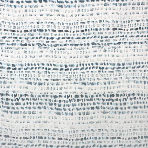
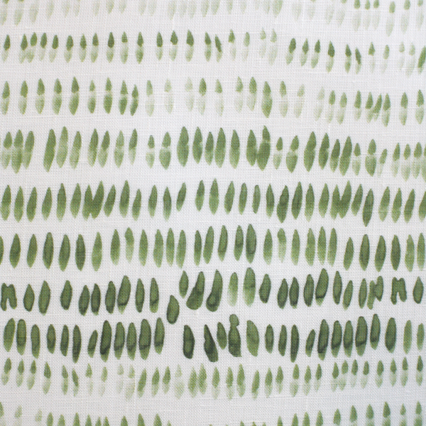
Once the wash was dry, and I had probably done this same thing in about five different sketchbooks, I came back to it with a smaller brush and dabbed it across the page with white paint. The result was a scattering of marks with a slight motion that hints at movement. It reminded me of the small moments in a landscape I’m often drawn to:
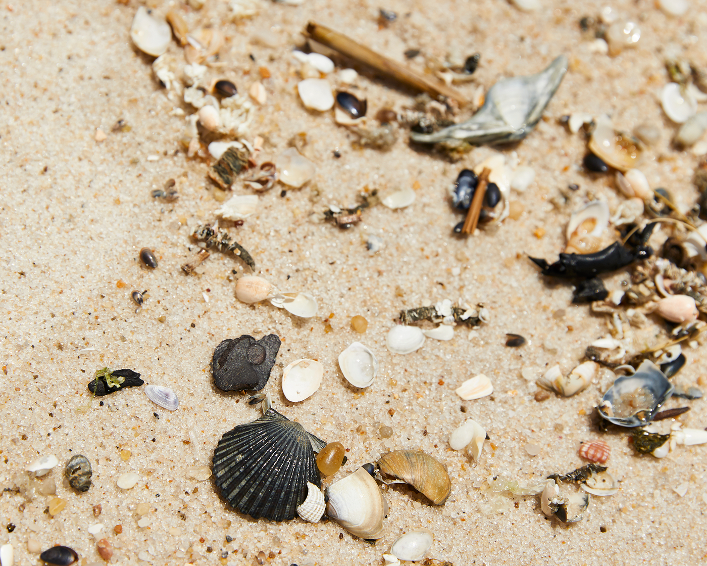
Stones, sand, and broken shells shifted by waves
Seeds scattered across the earth
Sunlight filtered through the greenery, casting dappled patterns on the ground
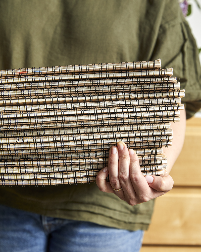
I created the artwork before I decided to add digital printing as a production method, but when I did decide to try digital printing, this was one of the first patterns. I chose this method because it allowed me to capture the full variation of value and hue from the original artwork—something that screen printing couldn’t achieve.
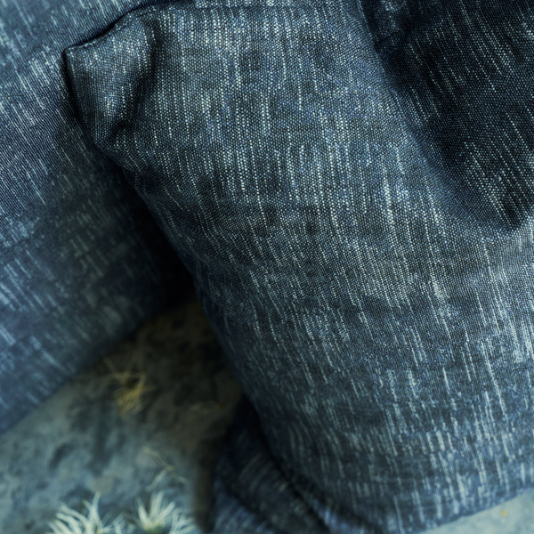
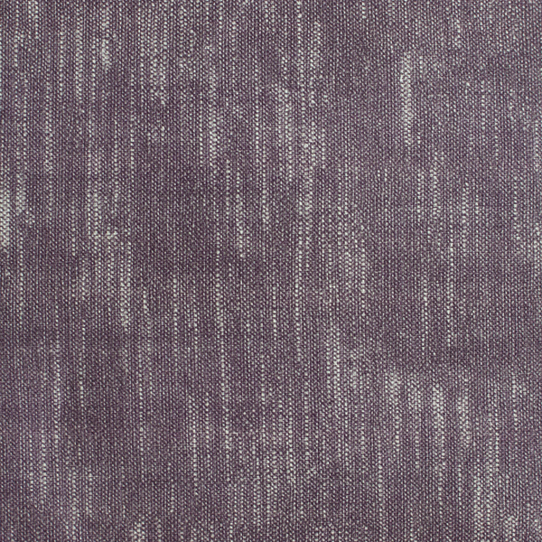
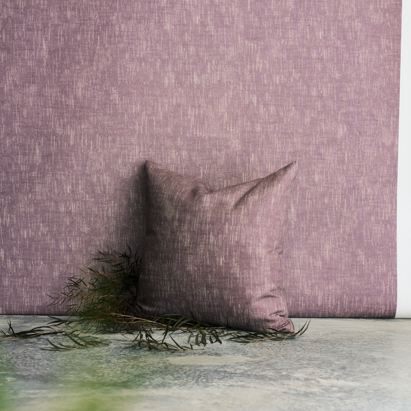
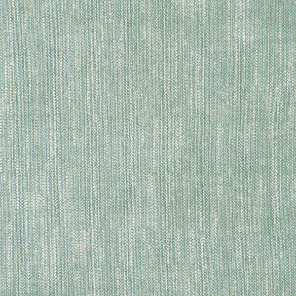
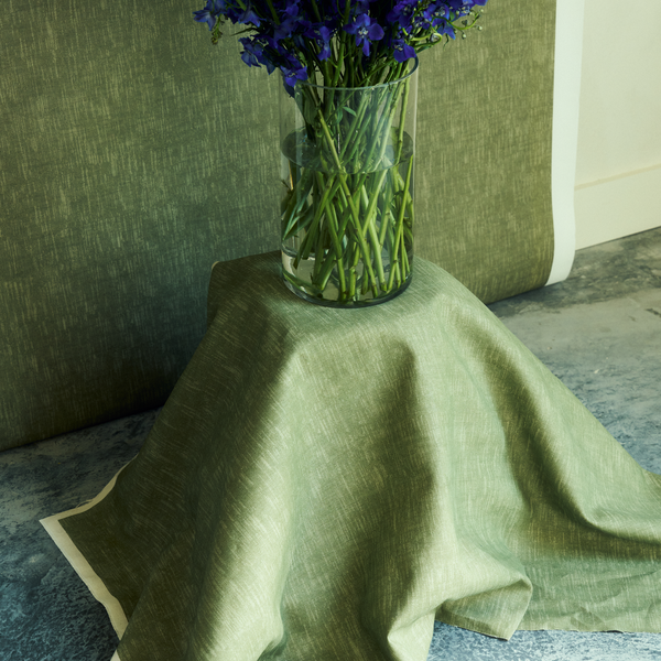
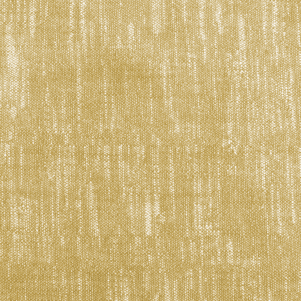
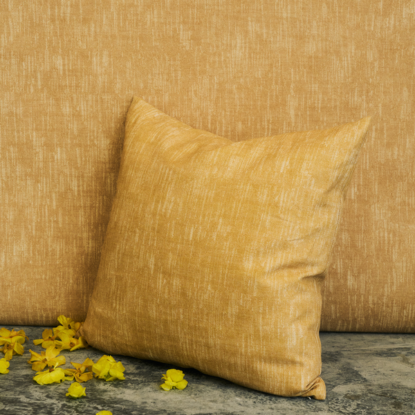
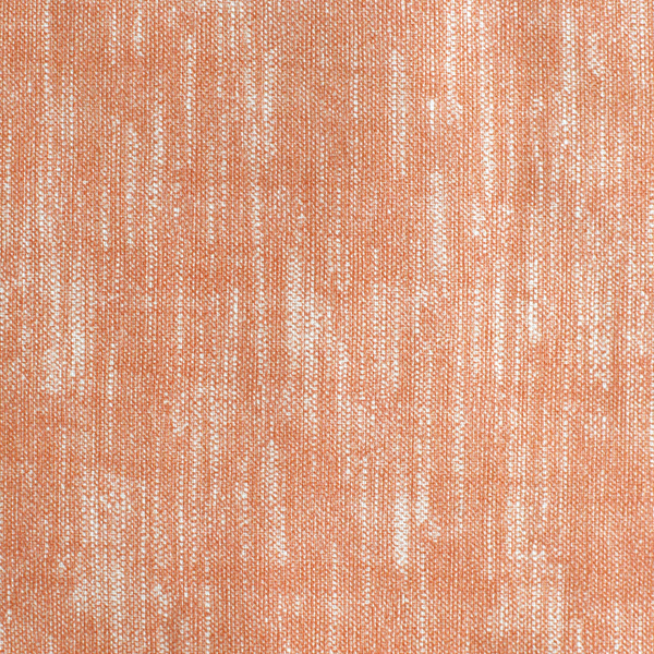
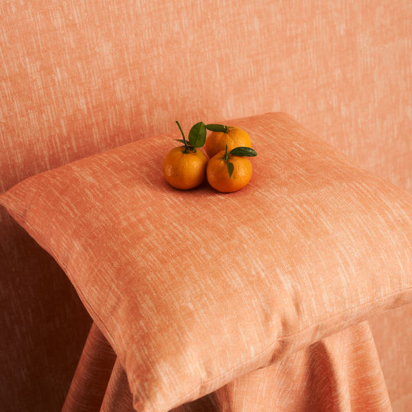
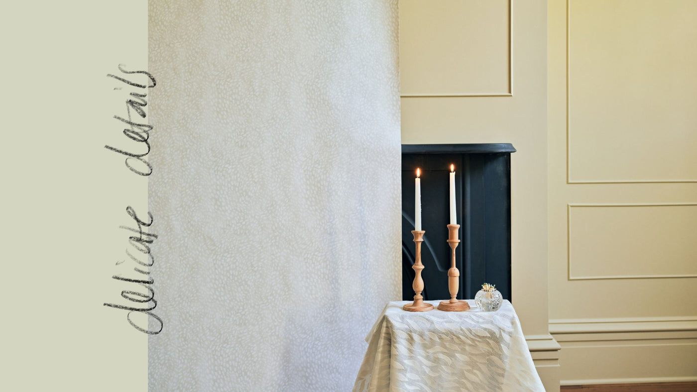
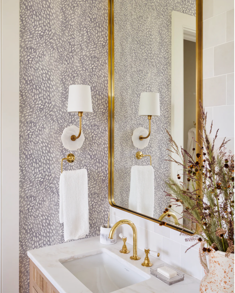
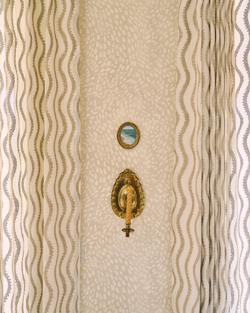
Now, ten years later, I’ve expanded the color palette for Speckled. I’m not sure why it took me so long, as it’s always been one of my favorites. Its subtle, painterly motion brings a grounded yet dynamic atmosphere to a room. I hope these new colorways will connect with you and find their way into your projects.