
Rebecca’s Inspiration: The Color Collection
May 28th, 2025
I’ve always wanted to create fabric and wallcoverings that capture colors the way I see them in nature. When I notice a hue or color combination out in the world that I want to use in my art, I immediately think of what paint colors I would use to recreate it. I can imagine each pigment and how I would mix them together to make exactly what I want. That process has become very intuitive to me over the years. It’s how I play with color when I’m developing new ideas and how I make individual color standards for my color bins. (I paint my own instead of using Pantone chips so that I can be very precise about my color choices.) There’s always some testing to see how light or dark or warm or cool a color looks once the paint has dried, to get it exactly the way I want, but my initial formula doesn’t change too much. When I’m mixing colors, I try not to think too much and let my instincts guide me.

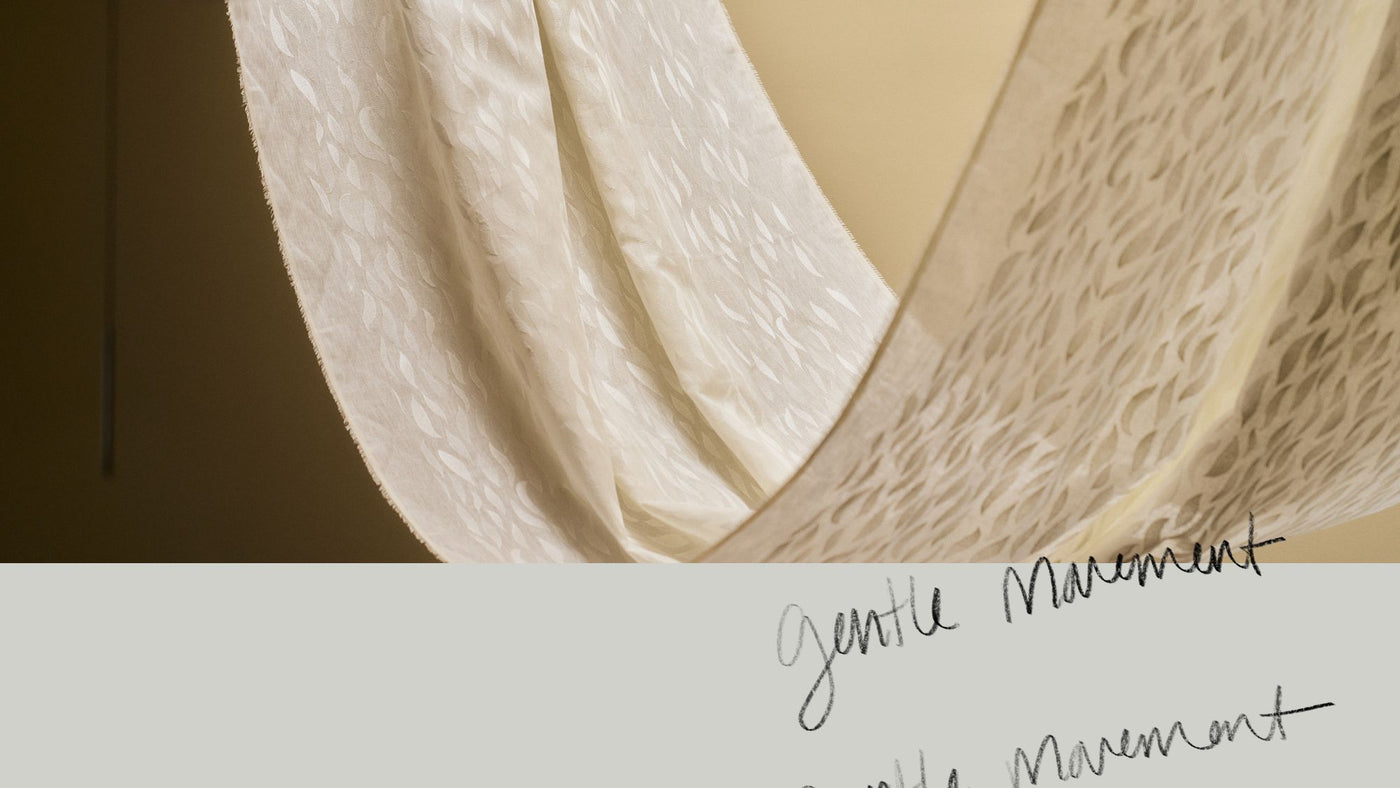
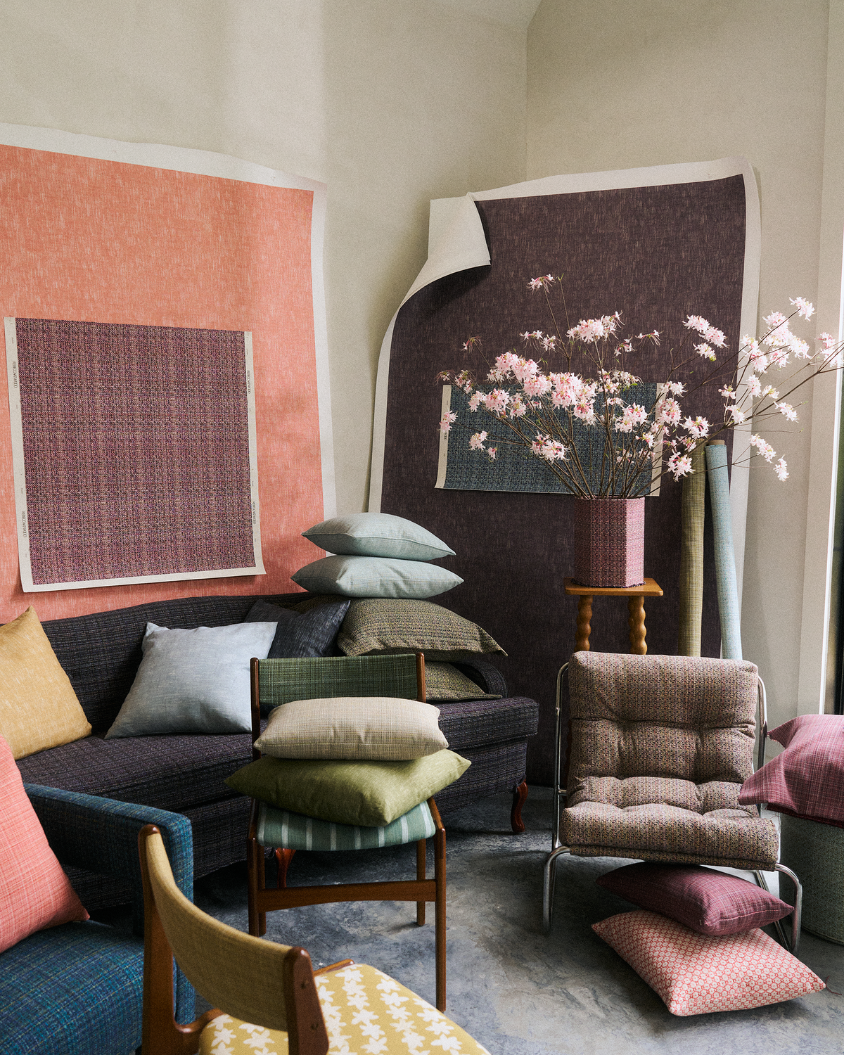
I designed our new Color Collection—our first-ever solid offerings—with this process of mixing and experimenting in mind, and I’m thrilled to finally share it with you. The three fabrics and two grasscloth wallcoverings we’re launching it with now are woven or printed to appear solid from a distance but reveal a beautiful array of hues up close. The carefully crafted colors are rooted in a specific moment in a particular landscape I love. Several of them—like rich, complex reds and earthy yellows—are colors we’ve never offered before.

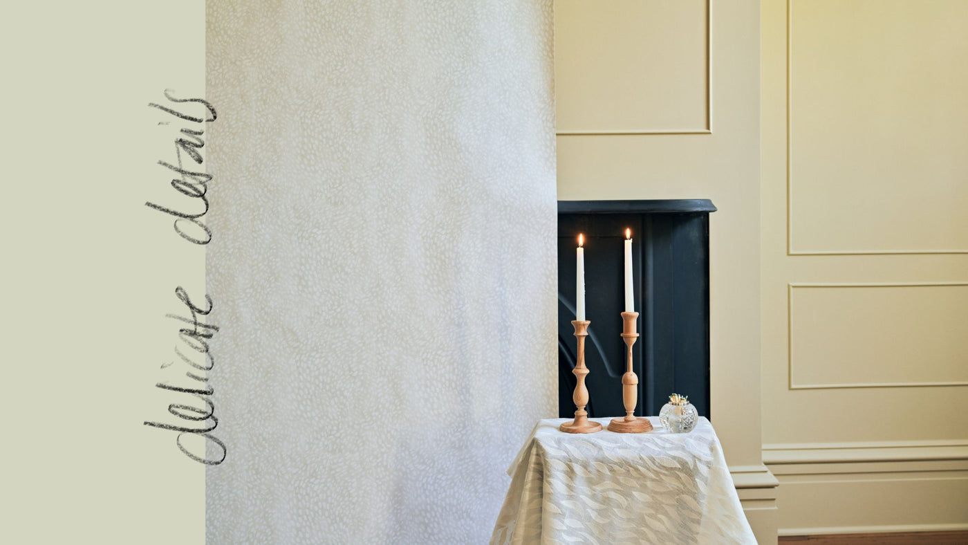
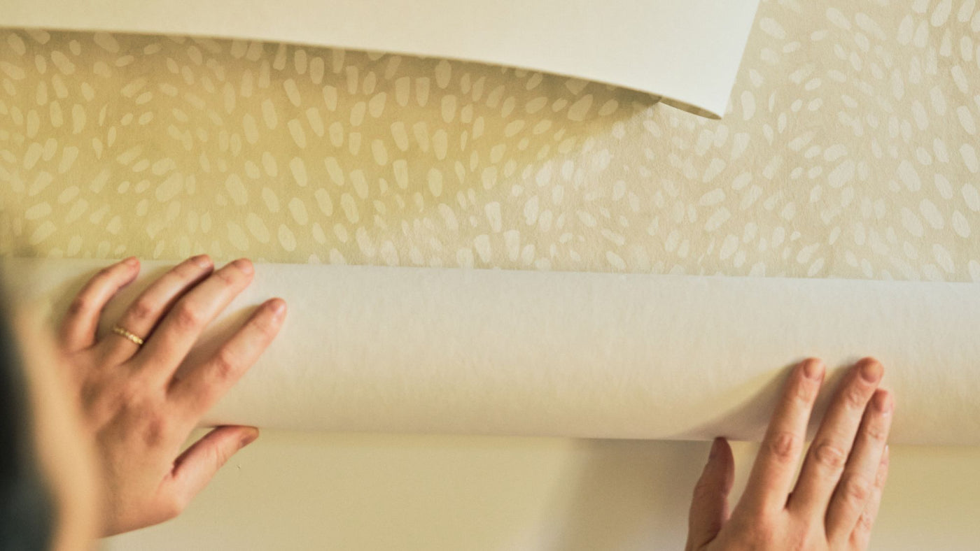
I experimented with the designs, the grounds for the wallpaper, and the yarns for the fabric until I found combinations that made the colors look their most beautiful. Bramble is a thick, substantial woven fabric made mostly of recycled cotton, with some synthetic fibers for durability and a little wool to give it a heft that’s ideal for upholstery. I love how the yarns soak up the deep, juicy colors. The texture also comes through in our grasscloth wallcovering, which I shifted a bit in scale and contrast to give it the same tactile quality; when the light hits it, it has a sheen almost like raw silk. Park is a midweight indoor-outdoor fabric with a simple but textured weave that makes the washed colors look even softer. Because it’s made of synthetic threads, it’s very durable and bleach cleanable. Alder is a printed design inspired by the weave texture of a fabric woven with a slub yarn. I’ve always loved how the original pattern has this slub yarn that gives it a lovely hand, and this abstracts it a bit more. It’s printed on linen and our nonwoven fibre paper, and the pattern has an almost illusory effect that makes both materials appear even more textured, like raw denim.

As with painting, the beauty of our new textiles is in the way we notice the colors and how they make us feel. The quiet but rich texture of the wallpapers instantly envelops any room in a way totally unlike painted walls, and the fabric subtly reveals an array spectrum of engaging colors. I hope they inspire you to bring more color into your work.
Thank you, Rebecca


